Graph using DfT data shows biggest increase in cycling for two years
Posted on in Business News , Cycles News
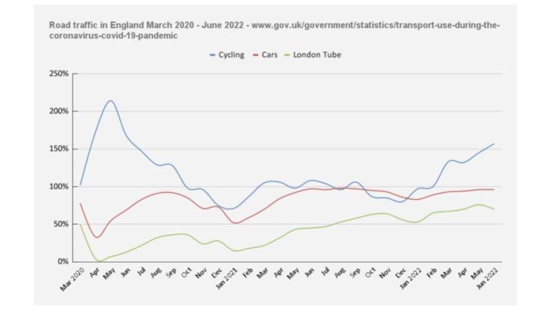
M ark Brown, guest writer for the ACT, has created a graph using DfT data that compares the use of different vehicles over the past two years, alongside an analysis.
To let us know your comments on the article, head to Twitter and tag @theACT_UK.
"It has been so hot these past few nights that I have not slept much. So, with some spare time on my hands in the wee small hours I put the latest Department for Transport (DfT), United Kingdom road traffic statistics into a graph.
It's an itch I've been wanting to scratch for a while. To see what's been happening to cycling and car use, since the cost of living increases over the last few months. And how this compares to the pandemic years.
This data is for England only. It compares with a pre-lockdown week in March 2020. Link to the data in the comments.
My thoughts:
Since February 2022 we have begun to see the biggest increase in cycling for two years, since March 2020.
That's not the usual start of the cycling season, which normally happens in late April after Easter.
From January 2022 to June 2022 the cost of a litre of unleaded petrol increased about 30%, from 145.5p to 190.1p. It's even higher now.
Bike shops continue to report that new bike sales remain very challenging. This growth in cycling is driven by existing bike owners. Perhaps a combination of regular riders cycling more, and others dusting-off bikes bought in the pandemic to use again.
Bike hire and share schemes must be doing well.
Not clear if this cycle use is for leisure, commuting or shopping trips etc.
Car use remains between 95%-97% of pre-pandemic levels. I read a report a few weeks ago which said road traffic was down more during the week, but went back up at the weekends.
With about 38m cars registered in the UK, even a small drop of a few percentage points means 1m cars not being driven.“